Episode 5: Our Favorite Paint Colors
Our Favorite Paint Colors
Join Joann Kandrac and Kelly Kole as they share paint color trends, especially reflected in the automobile, fashion and interior design industries.
IN THIS EPISODE:
I. Intro
a. Color trends – The major players
b. Our favorites NOW
c. Our favorites over the years
d. Our Not so favorites
II. Pantone – What is it?
“As individuals around the world become more fascinated with color and realize its ability to convey deep messages and meanings, designers and brands are turning to companies like Pantone that forecasts global color trends for all kinds of seasonal trend forecasting, corporate branding, palette recommendations etc.”
a. Pantone Color of the year for 2018 – 18.3838 Ultra Violet – a bluish purple
— “Nuanced and full of emotion, the depth of PANTONE 18-3838 Ultra Violet symbolizes experimentation and non-conformity, spurring individuals to imagine their unique mark on the world, and push boundaries through creative outlets.”
— “Enigmatic purples have also long been symbolic of counterculture, unconventionality, and artistic brilliance. Musical icons Prince, David Bowie, and Jimi Hendrix brought shades of Ultra Violet to the forefront of western pop culture as personal expressions of individuality.”
— Story of a clients design
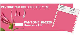
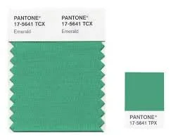
— Favorite Pantone colors: 2011 Honeysuckle, 2013 Emerald
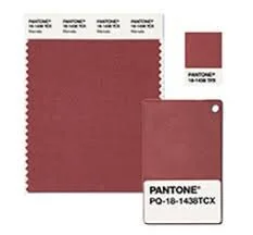
— Not so favorite: 2015 Marsala, 2016 Rose Quartz/Serenity
III. Sherwin Williams Color of the Year – Oceanside 6496 – A mix of rich blue and jewel-toned green
a. Marine Like
b. Boosts creative thinking (like what Pantone talked about)
c. Can be used in different design styles from coastal to midcentury modern.
d. Client story where we used this color – Hilton Head House – tired of the same robins egg blue. This home is a rental that has 7 bedrooms and 7 bathrooms. Sleeps approximately 30 people.
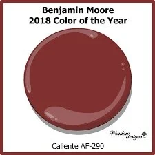
IV. Benjamin Moore Color of the Year – Caliente AF-290 – A vibrant red with a tiny touch of orange
a. Team of 7 people – visiting 12 countries, 30 cities, 23 industry shows, taking 42,000 photos and working for 12 months on 1 color of the year
b. This red is symbolic, smart and signifying change and strength
c. Haven’t used red in a long time!
V. Our favorite way to use paint
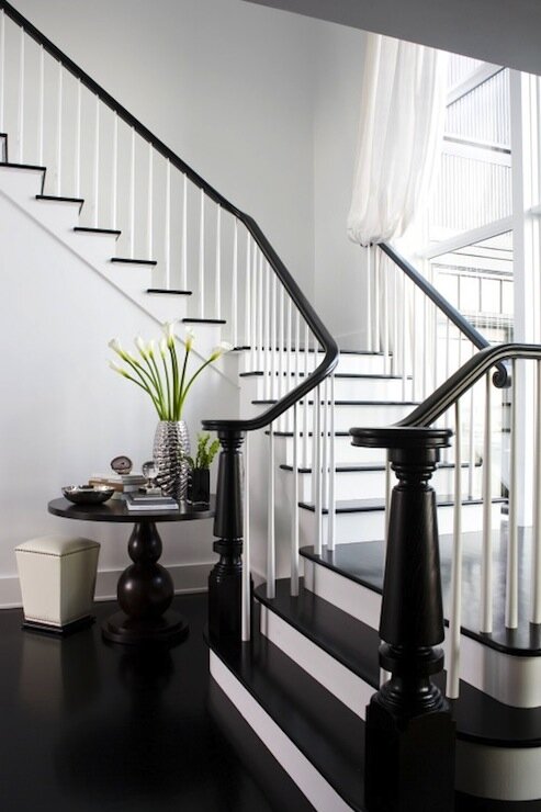
a. White spindles with black banister
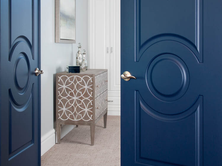
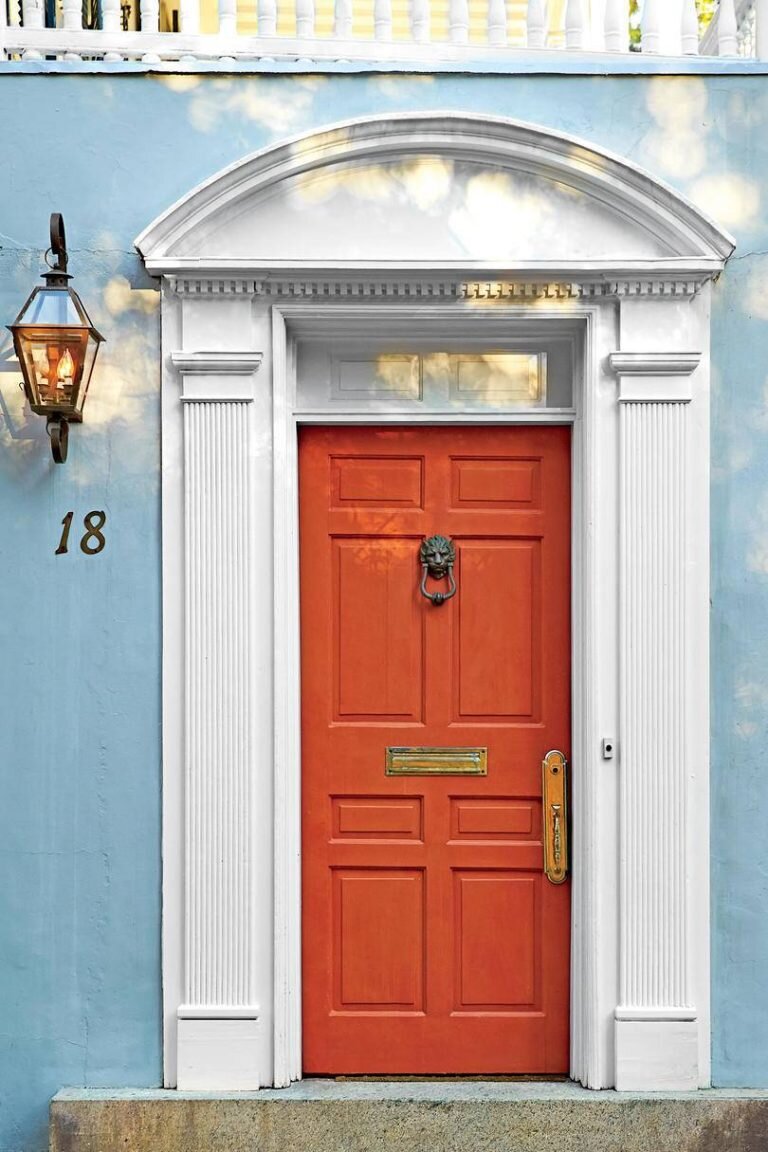
b. Contrast color for doors
c. Play with sheen levels
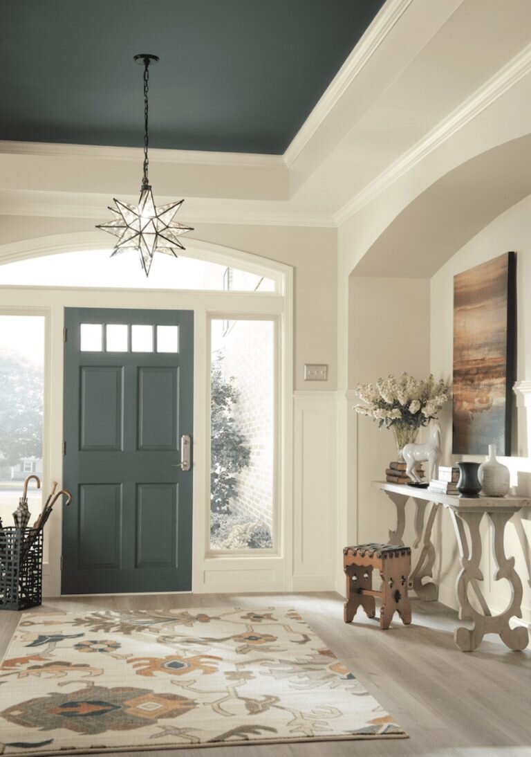
d. Ceilings
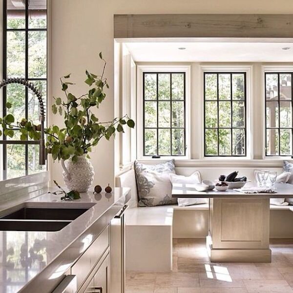
e. Black trim on windows and mullions – photo credit – Jeffrey Dungan
f. A bright front door – orange blue and yellow – Photo: Hector M. Sanchez

VI. Our favorite paint colors over the years
a. Loggia – SW 7506 – A warm, taupey tan with a hint of grey
b. Wythe Blue – BM HC-143
c. Westhighland White – SW 7566
d. White Dove – BM OC-17
e. Tricorn Black – SW6258
f. Salty Dog – SW 9177
g. Repose Grey – SW 7015
h. Agreeable Gray – SW 7029
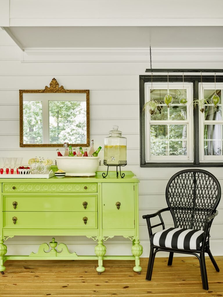
i. Green Thumb – BM CSP-870 – my lacquered buffet
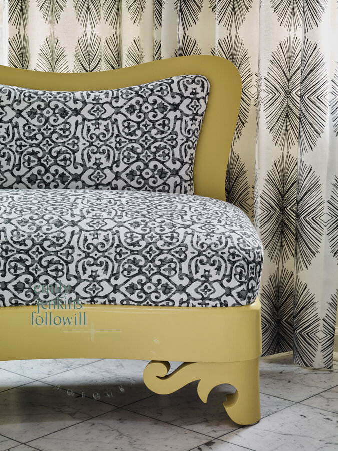
j. Freedom Trail – BM 277 – Joann’s Biedermeier sofa
VII. Audience Call Ins
a. Donna – painting a kitchen wall
b. Nancy – exterior painting
c. Kelsey – painting a fireplace


