How to Mix Traditional and Contemporary in Design
I realized recently when working with a client with a traditional sense of style in a 1910 era farmhouse that unless you are exposed to a variety of design aesthetics on a regular basis, you might not be comfortable with (or know how to) mix styles. In these cases, I think the only way to set our clients minds at ease is to share visuals on how we are able to mix traditional and contemporary design (as these seem to be the two aesthetics that we mix the most).
When my husband and I downsized into a new house in Woodstock, GA, I consolidated many of my antiques and more traditional pieces into my guest bedroom and master bedroom. However, not without adding in some contemporary artwork throughout which was the easiest way for me to infuse some fresh vibes. I was so happy to find this originalabstract art bySally Powell BoydfromGregg Irby Gallery or my guest bedroom. I also added the Stanton carpet (cut to the perfect size) in a cheetah print for a little zush - animal prints will never go out of style and work in any design aesthetic.
Photography of Kole house byEmily Followill
Speaking of classic animal prints, I purchased these gorgeous cained chairs at Scott Antique Market for $75 for the pair and then promptly reupholstered them is some pricey Cowtan & Tout fabric (I had no choice - I was obsessed). I then paired then with my commissioned piece of art from Dallas artist Kelley O'Neil. A great mix if you ask me!
Another way to integrate different styles and type periods is to reupholster vintage pieces with current fabrics. In my guest bedroom, I found this petite rocker for $75, recovered it in an updated houndstooth fabric with contrast welt and then jazzed it up with a blush color mohair pillow from West Elm. The sideboard on the right was also an antique find that I had painted and updated with new hardware. The brass and hand blown purple lamps I bought for $60 for the pair at a little vintage store in N. Georgia. I updated them with gorgeous silk shades with clean lines for a new look.
One of my favorite ways to combine traditional and contemporary is with paint (high gloss lacquer is my favorite) and wallpaper (if you don't have wallpaper in your house, contact us immediately so we can help you!). I'm completely in love with this design by Bachman Brown Design that was featured in House Beautiful.
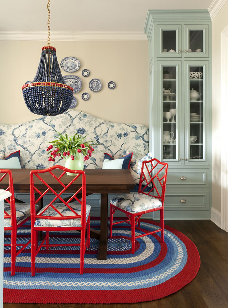
Arkansas designer Tobi Fairley did a fantastic job of using traditional pieces like the blue and white china and the toile fabric on the banquette with a unique mix of colors, lacquered chairs and a stunning chandelier to give this dining space a contemporary push.
Here is another space by designer Tobi Fairley that mixes traditional furniture pieces, fabrics and art with an unexpected color palette, a geometric rug and a WOW chandelier. Doesn't this visual help to see that mixing design aesthetics is a VERY good thing?
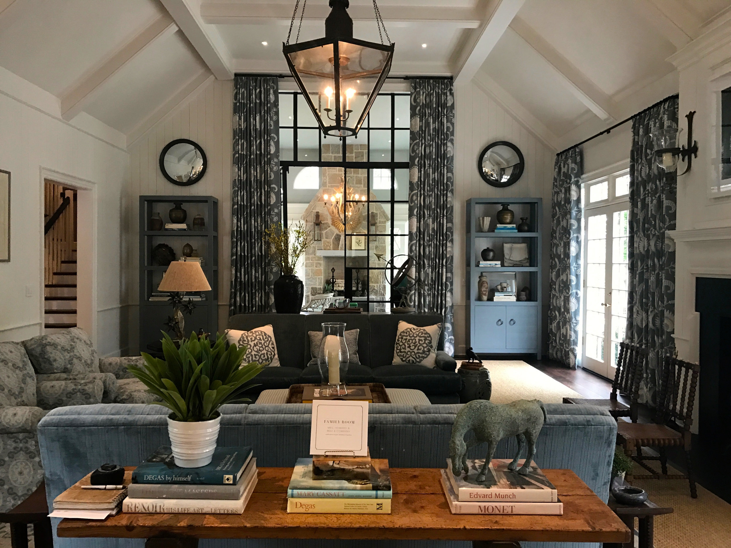
One last visual of the "new traditional" as many refer to it. I took this photo at the most recent Atlanta Homes & Lifestyles Designer Showhouse. This family room by designer Phoebe Howard stopped me in my tracks. It's traditional it is overall aesthetic but the fresh colors, symmetry and clean lines give it a fresh appeal.
So many of our clients say things to us like "Oh that old thing... that was just my great grandmothers... you don't have to use that..." Ummm excuse me but yes we do! We can paint it, reupholster it, lacquer it, restain it - whatever it takes to breath fresh life into it and then mix it with something unexpected like a fabulous piece of abstract or modern art.
Fun right?
Kelly


